|
This past project in my Digital Design class surrounded the idea of individually driven learning using HitRecord. HitRecord is an online collaborative production company founded by Joseph Gorden-Levitt. You are able to post or complete projects within your personal interests. My interests took me to the Illustration/ Graphic Design/ Photography projects. From there I found a few tasks that I might want to be a part of. I ended up choosing a project that involved creating designs for motivational coasters. I then narrowed that down to adding the theme of Disney. I did this because when you just search “motivational quotes” thousands of results appear, and within that, there are hundreds of categories. I chose Disney because I have always been interested in this company and their work. 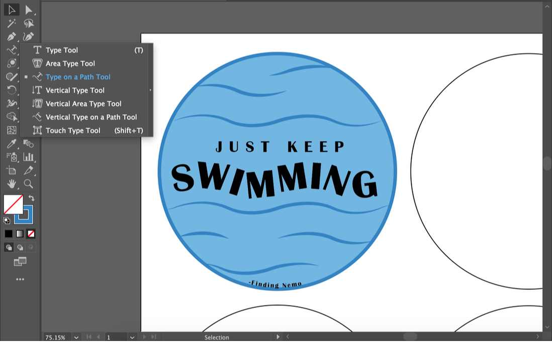 Once I decided on the Disney Theme, my mind instantly went to Finding Nemo and the infamous quote of “Just Keep Swimming” sung by Dory. This was my first coaster so I wasn’t exactly sure what direction I wanted to go with the rest. I played around a little in sketching my ideas but I ended up with the look of waves. To achieve the simplistic look I wanted, I needed to go beyond what I previously knew in Illustrator. The main tool I needed to learn was how to curve and customize how my words look. For this, I discovered the type on path tool. Once I found it, it was pretty straight forward in learning. 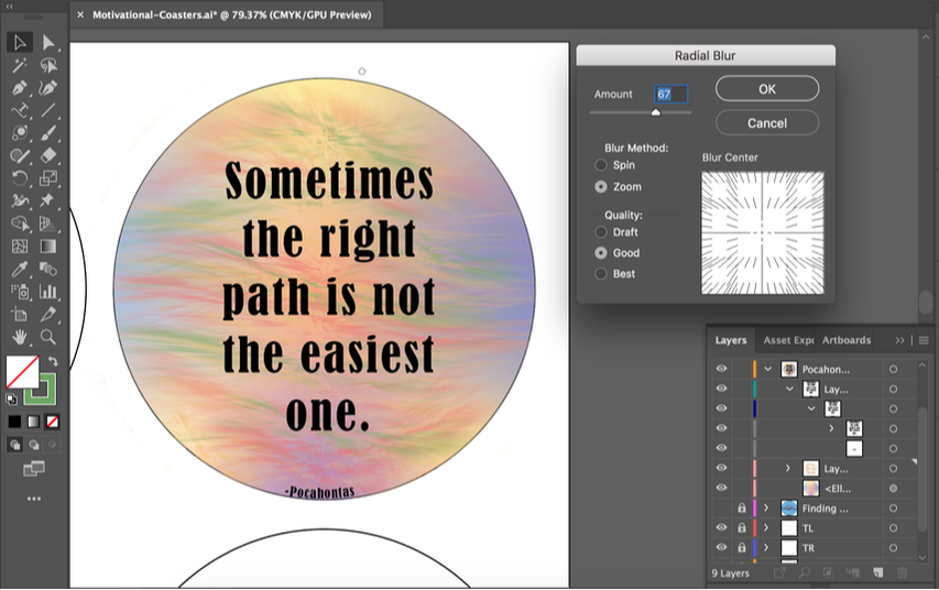 From there, I looked for other Disney quotes and landed on this one from Pocahontas. For this coaster, the vision was definitely not instant. I played around with a couple I ideas I had rolling around my brain and eventually landed on the scene of a path outlines with draping trees. However, as I developed this idea more and more in illustrator it looked worse and worse. About 2 days before the project was due, I ended up deleting the entire background. From there, I played around with gradient and blurring. I learned a lot with the gradient tool from the last two coasters so that wasn’t much of a challenge anymore. However, I don’t believe I have ever used the blurring effect in Illustrator so finding then playing around with it was interesting. I ended up doing very rough brush strokes then using the radial blur tool. This helped me immensely with achieving a windy fall feel. 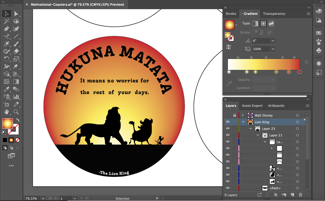 This coaster is definitely my favorite. I have always loved the phrase Hukuna Matata. For this, the color pallet was a given to me: warm sunsets. To achieve the look I wanted, I had to learn more about how to use the gradient tool. This was a challenge for me but now I know it forward and backward. From there I wanted to do something the letters so it wouldn’t be too boring to look at. I then made the phrase into an arc (now knowing how to curve text) but it still looked empty. I then added the definition as it states in the song. Once I had that, the top was fun and interesting but I just had the bottom as there the gradient all came together. My solution to this is drawing inspiration from the movie and creating a silhouette of the three characters who sing the song. This was very straight forward and in my realm of knowledge. 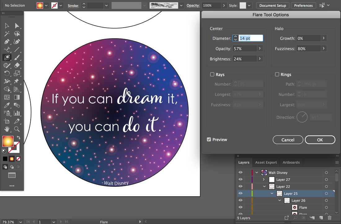 For my fourth and final coaster, I wanted to tie all of them back together and do a quote from the man that started it all. One of Walt Disney’s most famous quotes is “If you can dream it, you can do it.” For this one, I wanted to draw on the word “dream” and my initial vision was of a soft galaxy. Using the gradient tool of which I had just learned, I played around with the freeform aspect. From there, I needed to create the look of starts. This was a big challenge for me. Not knowing what to do I started just making two dots, one bigger with a lower opacity and the other smaller in the core of the larger with full opacity. This looked terrible. Then, I discover the life-saving flare tool. It took a little bit of time to understand it, but I eventually got it. I started off creating the look I wanted with one and then continued to copy and past it randomly. After that, I pasted another but made it increasingly smaller and copy and pasted than MANY times. For the text, I wanted “dream” and “do it” to stand out. After deciding this, I played around a lot with different fonts and how to make it look like they are supposed to go together. With all of these coasters, there was not one single design that went perfectly smooth. For each one, I just kept revising. For the Finding Nemo coaster, I got the base done and keep going back to change the flowing likes or to play around with the background. For the Pocahontas one, I played around a lot wit the first idea and ended up doing an entirely different one. For the Lion King one, I played around with the gradient and different colors for a good amount of time and at first didn’t include the silhouette. With the Walt Disney coaster, I tried different colors and at first didn’t change up the fonts. Revision is the key to making your work the best it can be. 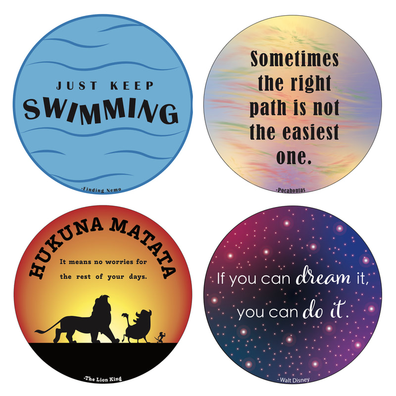 When asked what I would do differently for next time, I instantly had an answer. Next time, I would like to take out a piece of paper, draw the four circles, and brainstorm. I would have liked to choose ALL of the quotes beforehand then play around with different visuals that way they all look cohesive. Overall, This project was very interesting. In terms of my education with digital design, I learned a lot. Specifically, in Adobe Illustrator, I learned various skills across the board. This project has also taught me a lot about how I work. I have noticed that when working on an individually driven project, my experience with group projects has set me of for this. I find it surprisingly easy to divide up work and deciding what I should get done when. I think this project turned out to be reasonably successful.
0 Comments
Leave a Reply. |
Catagories
All
Archives
March 2020
|
 RSS Feed
